 |
Colour Mixing |
|
|
|
Colour Mixing |
|
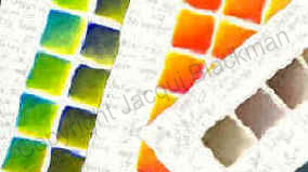
Colour mixing using Oil paint.
|
Colour mixing can be fascinating, fun or frustrating, depending on your interest, knowledge or experience. We hope this section will be of help and interest to those who wish to expand their knowledge of colour mixing with oil paint |
|
Primary Colours
| This Yellow - leans towards green. |
|
Two Primary Yellows |
|
This Yellow - leans towards orange. |
| Prussian Blue - leans towards green. |
|
Two Primary |
|
Ultramarine - leans towards violet. |
| This Red - leans towards violet. |
|
Two Primary |
|
This Red - leans towards orange. |
Making Secondary Colours
| To make the Secondary colour Green |
|
Yellow and Prussian Blue |
| To make the Secondary colour Orange |
|
Yellow and Red |
| To make the Secondary colour Violet |
|
Red and Ultramarine |
Mixing Neutral Colours.
We can make neutral colours by mixing complementary colours of the 'colour wheel':-
|
(Primary) Blue is opposite
|
||
|
(Primary) Red is opposite
|
||
|
(Primary) Yellow is opposite
|
||
|
From the original six Primary colours we have made six Secondary colours and using just opposites, we can make six neutral colours. |
||
|
Two pigment neutrals |
|
Red and |
 |
Black |
 |
and Ultramarine |
|
|
|
It can be very easy to make 'mud', but what is 'mud'? The 'muddy' colour produced is dreary, dirty and drab. One sure way to make 'mud' is to mix too many different pigments together. If we understand what makes 'muddy' colour, then we are part way to understanding how to make clean colour. In the neutral colour mix above three primary's were used: Yellow, Red and Prussian Blue. If we make this colour using a yellow made with two pigments e.g. an orange and a yellow. If you are finding it easy to make mud, check on the label for the pigment content of your paint and try working with the thought - less pigments = less mud. Another point to remember, you may want to add Black or White to the colour you've made - adding more pigments. White is not usually a problem, but Black is often blamed for muddying colours, by using a single pigment black (Ivory/Mars) the chances of this happening are greatly reduced. Copyright Jacqui Blackman © 1999 |
Back to Product
Copyright 1999 - 2023 © J. & T. Blackman Ltd. All Rights Reserved Worldwide.
The information contained herein is the Intellectual Property of Jacqui Blackman and
J. & T. Blackman Ltd., and is supplied without liability for errors or omissions.
Zest-it ® and its logo are Registered Trademarks.
No part may be reproduced or used except as authorized by contract or other written permission, unless stated otherwise.
The copyright and the foregoing restriction on reproduction and use extend to all media in which the information may be embodied.![]()


 complementary to Violet (Secondary)